Figcraft Documentation
Code-driven professional SVG diagram library for TypeScript / Node.js.
Installation
npm install figcraftRequires Node.js 18+. The library has no browser dependency — it runs entirely in Node.js.
Quick Start
Create a file diagram.ts and run it with npx tsx diagram.ts:
import { Figure } from 'figcraft'

const fig = new Figure(800, 400, { bg: '#fff' })

const a = fig.rect('Input', {
  pos: [50, 100], size: [120, 50],
  fill: '#e3f2fd', radius: 6
})

const b = fig.rect('Output', {
  pos: [250, 100], size: [120, 50],
  fill: '#c8e6c9', radius: 6
})

fig.arrow(a, b, { head: 'stealth', label: 'data' })

await fig.export('diagram.svg', { fit: true, margin: 20 })
Figure Constructor
new Figure(width?: number, height?: number, options?: FigureOptions)| Parameter | Type | Default | Description |
|---|---|---|---|
width | number | 800 | Canvas width in pixels |
height | number | 400 | Canvas height in pixels |
options | FigureOptions | {} | See FigureOptions below |
FigureOptions
| Property | Type | Default | Description |
|---|---|---|---|
bg | string | transparent | Background color |
fontFamily | string | system | Default font family |
mathFont | string | 'Times New Roman' | Font for $math$ formulas |
codeFont | string | 'Menlo' | Font for `code` spans |
fonts | string[] | [] | Register local font names |
autoAlign | boolean | true | Auto-align elements in same row |
antiOverlap | boolean | true | Auto-prevent arrow label overlap |
alignTolerance | number | 20 | Row detection Y tolerance (px) |
Font Registration
fig.font(name: string, source?: string)Register fonts for use in diagrams:
// Local system font
fig.font('PingFang SC')

// Google Fonts
fig.font('Inter', 'google')

// Custom URL
fig.font('MyFont', 'https://example.com/font.woff2')
Elements Overview
Figcraft provides 10 element types. All are created through fig.<type>(label, config?).
| Type | Method | Description | Key Config |
|---|---|---|---|
rect | fig.rect() | Rounded rectangle | radius |
circle | fig.circle() | Circle | r (default: 30) |
text | fig.text() | Text label (supports markdown) | fontSize, bold |
image | fig.image() | Embedded image | src, size |
diamond | fig.diamond() | Decision node | size |
trapezoid | fig.trapezoid() | Pooling / reduction | topRatio (0-1) |
cylinder | fig.cylinder() | 3D cylinder (DB/CNN) | depth (default: 0.15) |
cuboid | fig.cuboid() | 3D block (tensor) | depth (default: 15px) |
sphere | fig.sphere() | 3D sphere | r (default: 30) |
stack | fig.stack() | Multi-layer stack | count (default: 3), stackOffset |
2D Shapes
Rect
const box = fig.rect('Label', {
  pos: [50, 50], size: [120, 60],
  fill: '#e3f2fd', radius: 8,
  stroke: { color: '#1565c0', width: 2 }
})
Circle
const node = fig.circle('Node', {
  pos: [200, 100], r: 35,
  fill: '#fff3e0', color: '#e65100'
})
Diamond
const decision = fig.diamond('Yes?', {
  pos: [100, 100], size: [80, 60],
  fill: '#fce4ec'
})
Trapezoid
const pool = fig.trapezoid('MaxPool', {
  pos: [100, 100], size: [100, 50],
  fill: '#e8f5e9', topRatio: 0.55
})
Text
const label = fig.text('**Bold** and *italic*', {
  pos: [100, 50], fontSize: 14
})
Image
const img = fig.image('./photo.png', {
  pos: [100, 50], size: [120, 80]
})
3D Shapes
Cylinder
Great for databases and CNN feature maps. depth controls the ellipse ratio (0-1).
const db = fig.cylinder('Database', {
  pos: [50, 50], size: [100, 70],
  fill: '#e8f5e9', depth: 0.2
})
Cuboid
3D block for tensors and data volumes. depth is the extrusion distance in pixels.
const tensor = fig.cuboid('Feature Map', {
  pos: [50, 50], size: [80, 60],
  fill: '#fff8e1', depth: 18
})
Sphere
const node = fig.sphere('Attention', {
  pos: [100, 100], r: 35,
  fill: '#e0f7fa'
})
Stack
Multi-layer stacking effect. count sets layers, stackOffset controls offset per layer.
const layers = fig.stack('Conv ×4', {
  pos: [50, 50], size: [100, 60],
  fill: '#ede7f6', count: 4,
  stackOffset: [6, -6]
})
ElementConfig
All properties are optional. Apply to any element type.
| Property | Type | Description |
|---|---|---|
pos | [x, y] | Position (pixels or '%') |
size | [w, h] | Size (pixels or '%') |
fill | string | Fill color. 'none' = transparent |
fillOpacity | number | Fill transparency (0-1) |
color | string | Theme color (sets stroke + fontColor) |
stroke | string | StrokeConfig | Border. 'none' = no border |
radius | number | Corner radius (Rect) |
r | number | Radius for Circle/Sphere (default: 30) |
opacity | number | Overall opacity (0-1) |
shadow | boolean | ShadowConfig | Drop shadow |
padding | number | Inner padding |
fontSize | number | Font size in px |
fontFamily | string | Font family |
fontColor | string | Text color |
fontWeight | string | number | Font weight |
bold | boolean | Shorthand for fontWeight: 'bold' |
topRatio | number | Trapezoid top/bottom ratio (0-1, default: 0.6) |
depth | number | Cylinder: ellipse ratio (0.15). Cuboid: extrusion px (15) |
count | number | Stack layer count (default: 3) |
stackOffset | [dx, dy] | Stack per-layer offset (default: [6, -6]) |
{ color?: string, width?: number, dash?: number[] }Dash examples:
[6, 3] = dashed, [2, 2] = dotted
{ dx?: number, dy?: number, blur?: number, color?: string }Use
shadow: true for defaults, or pass a config object.
Nesting (Containers)
Any element can contain child elements. Children are positioned relative to their parent:
const parent = fig.rect('Container', {
  pos: [50, 50], size: [200, 150]
})

// Children use percentage positioning relative to parent
parent.circle('Center', { pos: ['50%', '50%'], r: 20 })
parent.rect('TopLeft', { pos: [10, 30], size: [60, 30] })
Basic Arrow
fig.arrow(source, target, config?)Connect two elements. Auto-snaps to nearest edges if no anchor is specified.
fig.arrow(a, b)  // simplest form
fig.arrow(a, b, { head: 'stealth', color: '#1565c0' })
Anchor Points
Control exactly where arrows connect to elements:
// Simple: specify a side
fig.arrow(a, b, { from: 'right', to: 'left' })

// Detailed: specify side + position along edge (0-100%)
fig.arrow(a, b, {
  from: { side: 'bottom', at: 30 },  // 30% from left on bottom edge
  to: { side: 'top', at: 70 }         // 70% from left on top edge
})
Arrow Head Types
11 built-in arrow head styles:
| Head | Description |
|---|---|
triangle | Solid triangle (default) |
triangle-open | Open triangle |
stealth | Sharp arrow (LaTeX style) |
vee | V-shape > |
circle | Solid circle |
circle-open | Open circle |
diamond | Solid diamond |
diamond-open | Open diamond |
bar | Vertical bar | |
dot | Small dot |
none | No arrowhead |
Path Types
| Path | Description | Extra Config |
|---|---|---|
straight | Direct line (default) | - |
curve | Bezier curve | curve: bend amount (positive=up) |
polyline | Right-angle path | cornerRadius: rounded corners |
// Curved arrow
fig.arrow(a, b, { path: 'curve', curve: 40 })

// Polyline with rounded corners
fig.arrow(a, b, { path: 'polyline', cornerRadius: 8 })
Styles & Labels
fig.arrow(a, b, {
  style: 'dashed',           // 'solid' | 'dashed' | 'dotted'
  color: '#e65100',
  width: 2,
  label: 'data flow',
  bidirectional: true,       // double-headed arrow
  headSize: 10
})
arrows() — Fan-out / Fan-in
Create multiple arrows at once. Supports 1-to-many and many-to-1:
// Fan-out: one source to many targets
fig.arrows(source, [targetA, targetB, targetC], {
  head: 'stealth', color: '#1565c0'
})

// Fan-in: many sources to one target
fig.arrows([srcA, srcB, srcC], target, {
  head: 'triangle', style: 'dashed'
})
fork() — Branching
Create a forking arrow with a shared main trunk that splits to multiple targets:
fig.fork(source, [targetA, targetB, targetC], {
  head: 'stealth',
  style: 'solid',
  color: '#333'
})
arrows() draws individual arrows from source to each target.
fork() draws one trunk from the source, then splits into branches — like a tree.
row()
Arrange elements horizontally. The first element must have pos set.
fig.row([a, b, c], { gap: 40 }) // default gap: 40px
col()
Arrange elements vertically.
fig.col([a, b, c], { gap: 30 })
grid()
Arrange elements in a grid.
fig.grid([a, b, c, d, e, f], {
  cols: 3,        // 3 columns (default)
  gap: 20,        // uniform gap
  rowGap: 30,     // override vertical gap
  colGap: 15      // override horizontal gap
})
group()
Draw a labeled frame around elements. Call after layout methods (needs resolved positions). Returns a Rect that can be used as an arrow target.
const frame = fig.group([a, b, c], {
  label: 'Pipeline',
  fill: 'rgba(25,118,210,0.05)',
  stroke: { color: '#90caf9', dash: [6, 3] },
  radius: 8,
  padding: 20,
  fontSize: 11,
  fontColor: '#1565c0',
  size: [400, 200]    // optional fixed size (auto-centers members)
})
Markdown in Labels
All element labels support inline markdown formatting:
| Syntax | Result | Font |
|---|---|---|
**bold** | bold text | Same font, bold weight |
*italic* | italic text | Same font, italic |
`code` | monospace | codeFont (Menlo) |
$E=mc^2$ | math formula | mathFont (Times New Roman) |
fig.rect('**Conv2D** $3 \\times 3 \\times 64$', { ... })
fig.text('Loss: `cross_entropy`', { ... })
Export Formats
File format is auto-detected from the file extension:
| Extension | Format | Engine |
|---|---|---|
.svg | SVG vector | Built-in |
.png | PNG raster | sharp |
.jpg / .jpeg | JPEG | sharp |
.webp | WebP | sharp |
.pdf | PDF document | pdfkit |
// SVG
await fig.export('output.svg', { fit: true, margin: 20 })

// High-res PNG
await fig.export('output.png', { fit: true, scale: 3, margin: 30 })

// Get SVG string without saving
const svg = fig.render({ fit: true })
ExportOptions
| Property | Type | Default | Description |
|---|---|---|---|
fit | boolean | false | Auto-crop to content bounds |
margin | number | 20 | Margin around content (when fit=true) |
scale | number | 2 | Resolution multiplier (raster only) |
quality | number | 90 | JPG/WebP quality (1-100) |
Export Format Showcase
One source file, every format you need. Click the tabs below to compare outputs:

fig.export('flowchart.svg')- Vector format — infinite scaling
- Smallest file size
- Full canvas size preserved

fig.export('flowchart.png')- Default 2x resolution
- White background
- Full canvas size
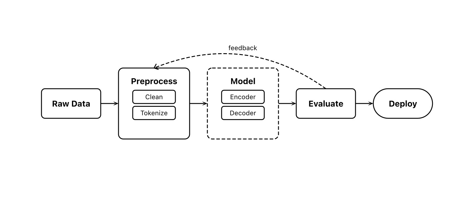
fig.export('flowchart.jpg', {
  fit: true, margin: 20
})
fit: trueauto-crops to content- 20px margin around content
- Quality: 90 (adjustable)
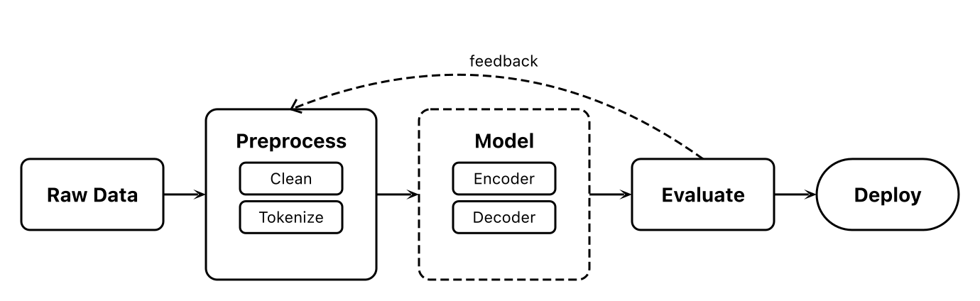
fig.export('flowchart-fit.png', {
  fit: true, margin: 20
})
fit: truecrops to content bounds- Removes excess whitespace
- Best for embedding in documents

// Omit bg = transparent background
const fig = new Figure(800, 350)
fig.export('out.png', { fit: true })- Omit
bgfor transparency - Checkerboard = alpha channel
- Great for overlaying on other content

fig.export('flowchart.webp', {
  fit: true, margin: 20
})- Modern format, smaller size
- Supports transparency
- Ideal for web publishing
MCP Integration
Figcraft includes a built-in MCP (Model Context Protocol) server. AI agents like Claude Code and Cursor can generate diagrams directly without writing code.
Setup
Add to your Claude Code or Cursor MCP settings:
{
  "mcpServers": {
    "figcraft": {
      "command": "npx",
      "args": ["figcraft-mcp"]
    }
  }
}
Then just describe your diagram to the AI: "Draw a Transformer architecture diagram with encoder and decoder stacks".
MCP Tools
| Tool | Description |
|---|---|
create_diagram | Create a diagram from a JSON spec. Returns SVG and optionally exports to file. |
get_element_types | Get the full API reference. AI calls this first to learn the API. |
JSON Specification Format
The create_diagram tool accepts this JSON structure:
{
  "width": 800,
  "height": 400,
  "bg": "#ffffff",
  "fontFamily": "Arial",
  "autoAlign": true,
  "elements": [
    {
      "id": "a",
      "type": "rect",
      "label": "Input",
      "pos": [50, 100],
      "size": [120, 60],
      "fill": "#e3f2fd",
      "radius": 6
    },
    {
      "id": "b",
      "type": "rect",
      "label": "Output",
      "pos": [300, 100],
      "size": [120, 60],
      "fill": "#c8e6c9"
    }
  ],
  "arrows": [
    {
      "from": "a",
      "to": "b",
      "fromSide": "right",
      "toSide": "left",
      "label": "data",
      "head": "stealth"
    }
  ],
  "groups": [
    {
      "members": ["a", "b"],
      "label": "Pipeline",
      "padding": 20,
      "stroke": "#999"
    }
  ],
  "layouts": [
    { "type": "row", "elements": ["a", "b"], "gap": 40 }
  ],
  "fanArrows": [
    { "from": "src", "to": ["a", "b", "c"] }
  ],
  "forks": [
    { "from": "root", "to": ["x", "y", "z"] }
  ],
  "export": {
    "path": "output.svg",
    "fit": true,
    "margin": 20
  }
}
Figure Class — All Methods
| Method | Returns | Description |
|---|---|---|
fig.rect(label, config?) | Rect | Create rectangle |
fig.circle(label, config?) | Circle | Create circle |
fig.text(content, config?) | Text | Create text label |
fig.image(src, config?) | Image | Create image |
fig.diamond(label, config?) | Diamond | Create diamond |
fig.trapezoid(label, config?) | Trapezoid | Create trapezoid |
fig.cylinder(label, config?) | Cylinder | Create 3D cylinder |
fig.cuboid(label, config?) | Cuboid | Create 3D cuboid |
fig.sphere(label, config?) | Sphere | Create 3D sphere |
fig.stack(label, config?) | Stack | Create stacked layers |
fig.arrow(src, tgt, config?) | void | Single arrow |
fig.arrows(src, tgt, config?) | void | Fan-out / fan-in |
fig.fork(src, targets, config?) | void | Branching arrow |
fig.row(els, opts?) | void | Horizontal layout |
fig.col(els, opts?) | void | Vertical layout |
fig.grid(els, opts?) | void | Grid layout |
fig.group(members, config?) | Rect | Group frame |
fig.font(name, source?) | void | Register font |
fig.render(opts?) | string | Render to SVG string |
fig.export(path, opts?) | Promise | Export to file |
ElementConfig — Full Reference
| Property | Type | Default | Description |
|---|---|---|---|
pos | [PosValue, PosValue] | - | Position [x, y]. Pixels or '%' |
size | [PosValue, PosValue] | auto | Size [width, height] |
fill | string | - | Fill color. 'none' = transparent |
fillOpacity | number | 1 | Fill opacity (0-1) |
color | string | - | Theme color (stroke + fontColor) |
stroke | string | StrokeConfig | - | Border config |
radius | number | 0 | Corner radius (Rect) |
r | number | 30 | Circle/Sphere radius |
opacity | number | 1 | Overall opacity |
shadow | boolean | ShadowConfig | false | Drop shadow |
padding | number | - | Inner padding |
fontSize | number | 14 | Font size (px) |
fontFamily | string | inherit | Font family |
fontColor | string | #000 | Text color |
fontWeight | string | number | normal | Font weight |
bold | boolean | false | Shorthand bold |
topRatio | number | 0.6 | Trapezoid ratio |
depth | number | varies | 3D depth |
count | number | 3 | Stack layers |
stackOffset | [number, number] | [6, -6] | Stack offset |
ArrowConfig — Full Reference
| Property | Type | Default | Description |
|---|---|---|---|
from | AnchorSpec | auto | Source anchor |
to | AnchorSpec | auto | Target anchor |
label | string | - | Text label |
labelOffset | number | auto | Manual label offset |
style | string | 'solid' | 'solid' | 'dashed' | 'dotted' |
color | string | '#000' | Arrow color |
width | number | 1.5 | Line width |
head | ArrowHead | 'triangle' | Head type |
headSize | number | auto | Head size |
bidirectional | boolean | false | Double-headed |
path | ArrowPath | 'straight' | Path type |
curve | number | 0 | Curve bend amount |
cornerRadius | number | 0 | Polyline corner radius |
ExportOptions — Full Reference
| Property | Type | Default | Description |
|---|---|---|---|
scale | number | 2 | Resolution multiplier (raster) |
fit | boolean | false | Auto-crop to content |
margin | number | 20 | Margin with fit=true (px) |
quality | number | 90 | JPG/WebP quality (1-100) |
MCP Integration — Let AI Generate Diagrams
Figcraft includes a built-in MCP (Model Context Protocol) server. Once configured, AI assistants can generate professional diagrams from natural language — no code needed.
Setup
Add the following to your AI client's MCP configuration:
Claude Desktop / Claude Code
{
  "mcpServers": {
    "figcraft": {
      "command": "npx",
      "args": ["figcraft-mcp"]
    }
  }
}
Cursor
Add the same configuration in Cursor Settings → MCP Servers.
Prerequisites: Only Node.js 18+ required. npx will auto-download the figcraft package on first run — no manual installation needed.
Available Tools
| Tool | Description |
|---|---|
get_element_types |
Returns the complete API reference. AI calls this first to learn all available element types, arrow options, and configuration parameters. |
create_diagram |
Takes a JSON specification and creates a diagram with file export. Supports 10 element types, 11 arrow heads, layout system, and multi-format export. |
Usage Example
After setup, just describe what you want in natural language:
- "Draw a flowchart with input, processing, and output steps"
- "Create a Transformer architecture diagram with Encoder and Decoder"
- "Make a database ER diagram linking users to orders"
The AI will automatically call create_diagram with a complete JSON spec, generating SVG/PNG files.
JSON specification example:
{
  "width": 600, "height": 200, "bg": "#fff",
  "elements": [
    { "id": "a", "type": "rect", "label": "Input", "pos": [50, 80], "size": [100, 50], "fill": "#e3f2fd", "radius": 6 },
    { "id": "b", "type": "rect", "label": "Process", "pos": [250, 80], "size": [100, 50], "fill": "#fff3e0", "radius": 6 },
    { "id": "c", "type": "rect", "label": "Output", "pos": [450, 80], "size": [100, 50], "fill": "#c8e6c9", "radius": 6 }
  ],
  "arrows": [
    { "from": "a", "to": "b", "head": "stealth", "path": "polyline" },
    { "from": "b", "to": "c", "head": "stealth", "path": "polyline" }
  ],
  "export": { "path": "flow.png", "fit": true, "margin": 20, "scale": 2 }
}
v0.2.0 Smart Routing in MCP
MCP mode fully supports the latest smart routing capabilities:
- Auto direction — No need to specify
fromSide/toSide, the system picks the optimal sides - Obstacle avoidance —
path: "polyline"arrows automatically route around other elements - Auto-straightening — Nearly horizontal/vertical arrows snap to perfect alignment
This means AI-generated diagrams don't need precise anchor calculations, significantly improving first-generation accuracy.
v0.2.0 Changelog
2026-02-02
Smart Auto-Routing
Arrows now automatically choose the optimal path without specifying from / to:
- Automatically determines source and target sides based on relative positions
- Polyline selects horizontal-start, vertical-start, or U-wrap mode as needed
- Detects exit/entry direction conflicts and switches to U-wrap routing
Polyline Obstacle Avoidance
- Polyline arrows automatically detect and route around third-party elements
- Vertical segment collision → horizontal offset; horizontal collision → U-shaped detour
- Multiple obstacles merged into a combined bounding box for a single clean detour
- Direction selection checks both candidates against obstacles before choosing
Internal Optimizations (Zero Config)
- Arrow auto-straightening — Endpoints within 8px snapped to perfect horizontal/vertical
- Shape-aware anchors — Trapezoid top edge follows topRatio; Cylinder follows elliptical face
- Smart label positioning — Polyline labels placed on the longest segment, clamped to canvas
- Layout centering fix —
row()/col()/grid()correctly handle Circle/Sphere center-based positioning
Supported Shapes
All 8 shapes support auto-routing and obstacle avoidance: Rect, Circle, Diamond, Trapezoid, Cylinder, Cuboid, Sphere, Stack
Contact
This documentation is primarily designed for AI consumption. If you're a developer who enjoys tinkering with tools like this, I'd love to hear from you — feel free to share ideas, suggestions, or feedback anytime.
Email: [email protected]